Local Colors
Local Colors was the product of a competitive pitch project my professor hosted in the fall of 2022. He paired us with a classmate to create a brand for the same organization and present a pitch at the end of the project. I ended up winning against my classmate and producing the 3rd best brand overall out of the entire graphic design senior class.
Logomark
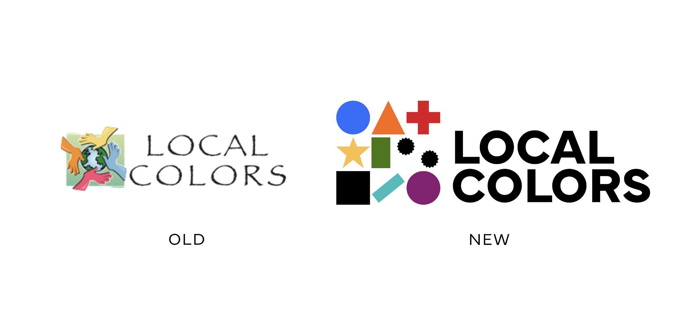
Old vs. New

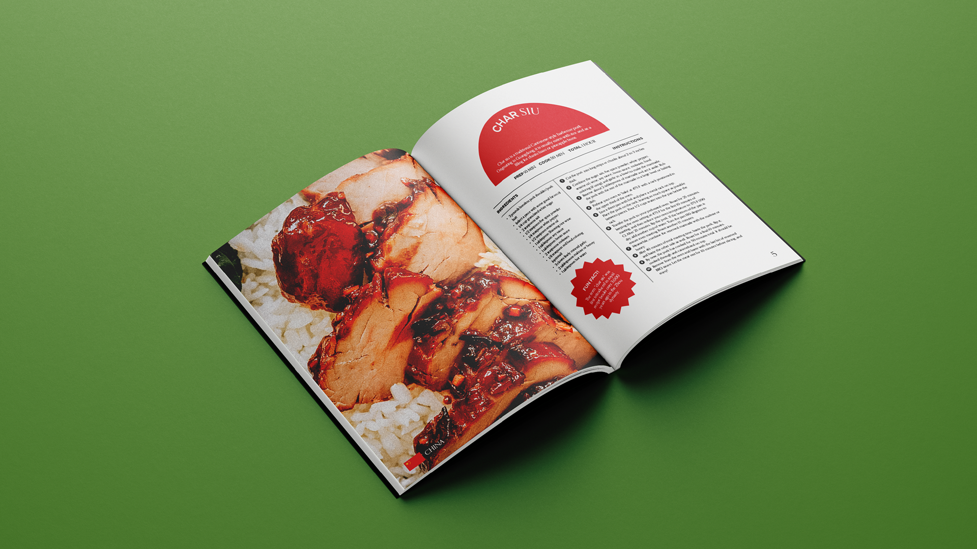
Cookbook
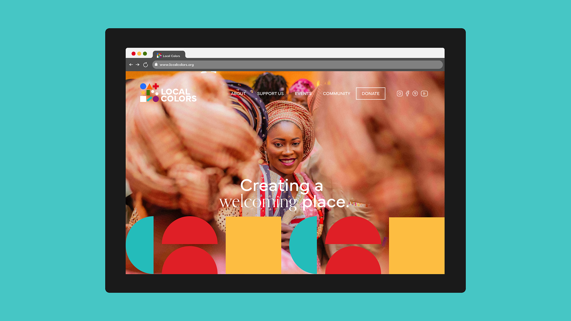
Website
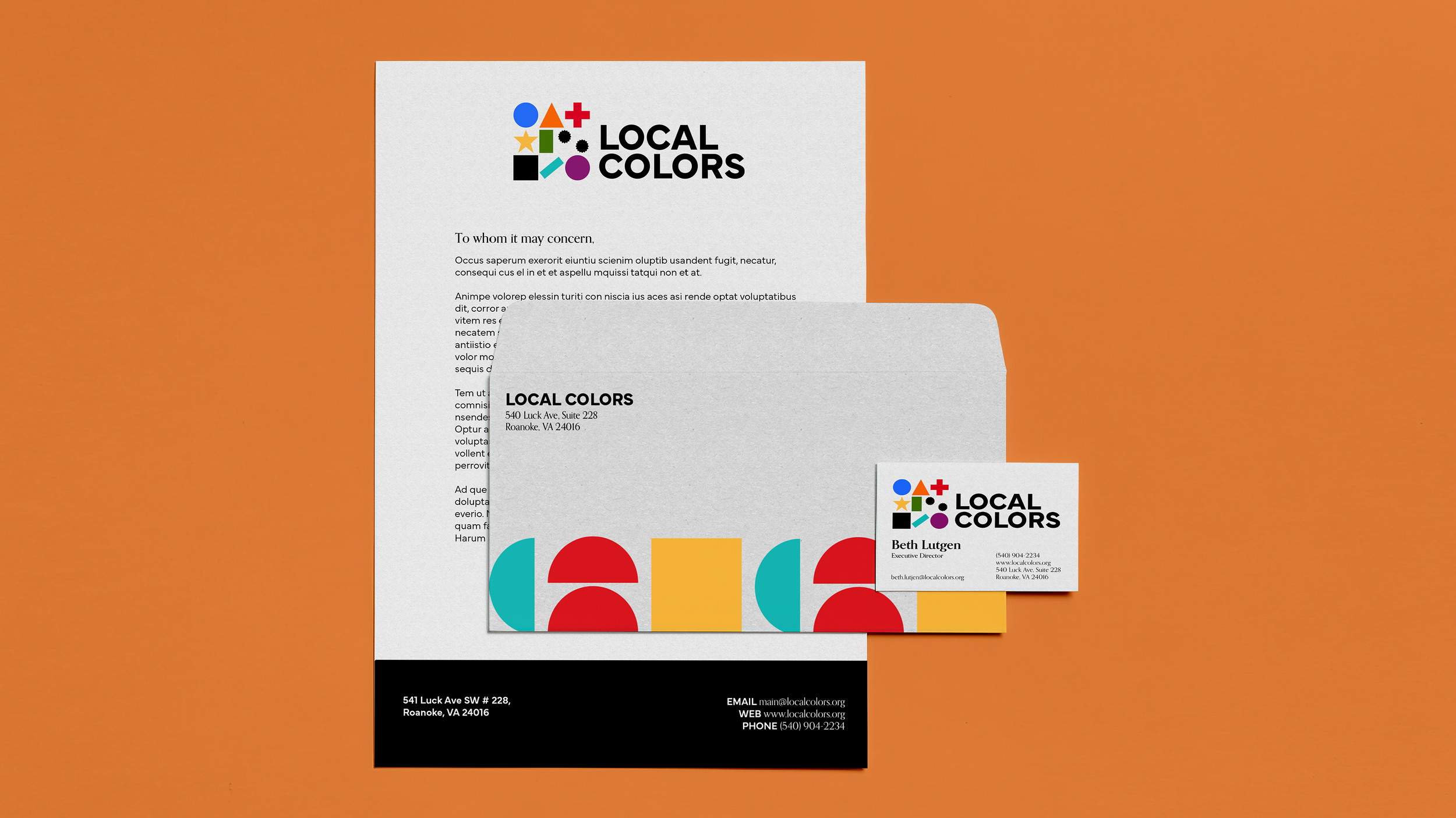
Stationary
About the Brand
Local Colors is a non-profit multicultural organization that is dedicated to celebrating 56 countries from around the world in the Roanoke area. Their mission is to spread awareness on the vast amount of cultures all over the globe and to help one celebrate their own through a handful of local talks, workshops, and events.
About the Design
With non profit organizations, their logos usually reflect the motive behind the non profit. When researching multicultural non profits like Local Colors, I saw many universal symbols of diversity and inclusion such as a globe with people holding it or a group of people making a heart or globe together. I took to researching symbols that people often identify culture, heritage, and ancestry with. I was looking into coins, stamps, tree rings, passports, and then landed on flags. Flags are simple devices, yet have so much meaning to the people who wave and celebrate them.
Flexibility was the utmost important to me while sketching for Local Colors. The logomark had to be flexible to include every country they celebrate. With flags being on my mind while sketching, I wanted to stress the value of each country’s flag so I took a piece from every flag ever made. All the shapes in the final logo are pulled from different countries’ flags meaning everyone can relate to what Local Colors is about.

